Case Studies
Real projects, real results — a closer look at how I've helped local businesses build a brand presence they're proud of.
Tom's Mowing & Maintenance
From an idea to a professional brand presence.
The clientTom's Mowing & Maintenance
The client
Tom's Mowing & Maintenance — a local lawn and property maintenance business looking to grow its recurring client base.
The challenge
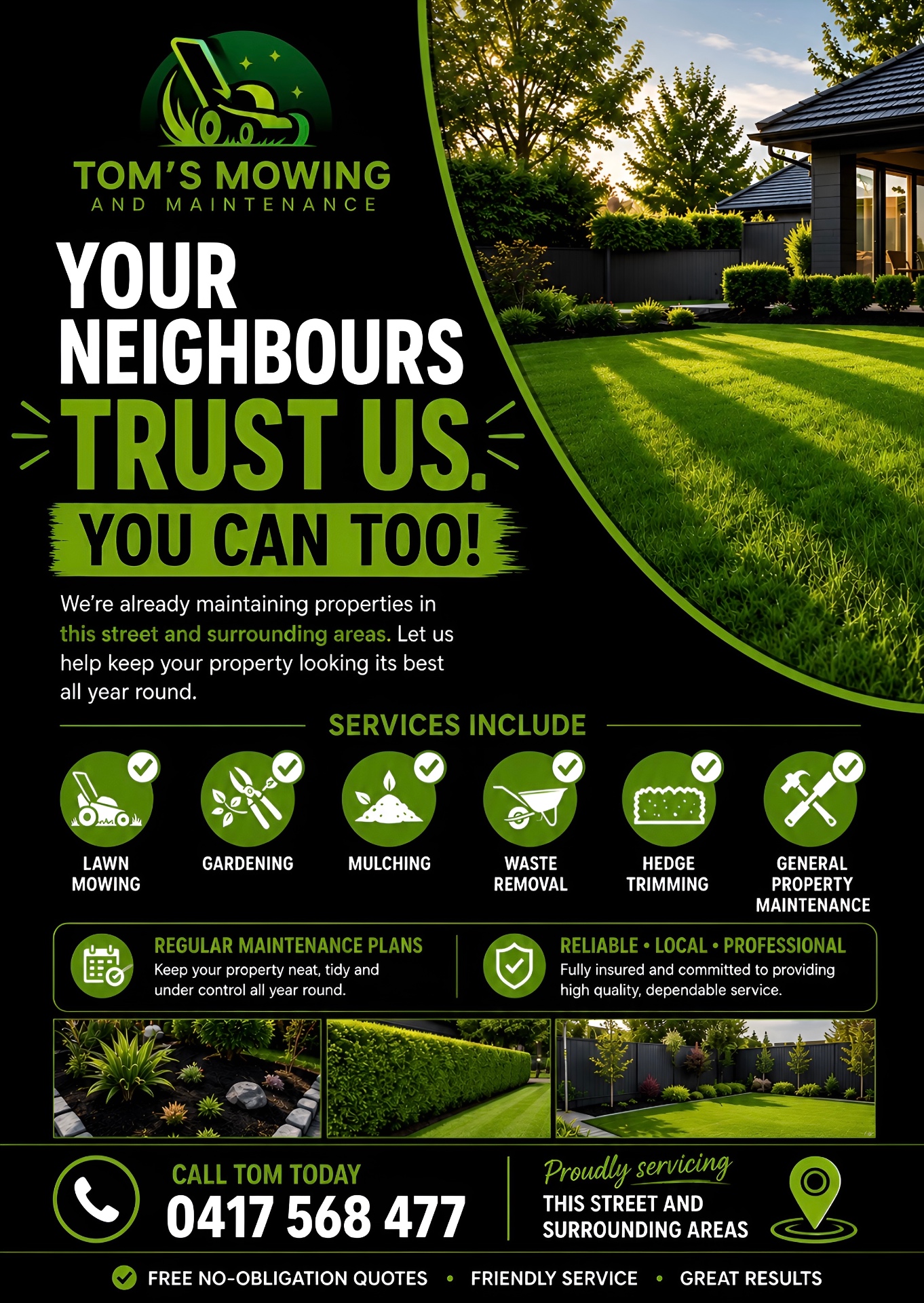
Tom wanted to secure more ongoing property-maintenance work close to his existing clients. His plan was to create a flyer to distribute to homes in the surrounding streets, using his existing local work to introduce his services to nearby homeowners.
What I delivered
I turned Tom's idea into a targeted flyer designed specifically for local letterbox distribution.
The flyer promotes his ongoing maintenance services while highlighting that he is already working in the local area, giving nearby homeowners a reason to consider Tom for their own property.
The result
Tom now has a clean, professional flyer he can distribute locally to turn nearby properties into ongoing maintenance work — and a brand presence that matches the quality of his service.
What my clients say
I can't recommend Chris Gillard highly enough.
He recently helped me with digital marketing and created flyers for my business, and the quality of his work was outstanding.
Chris took the time to understand my business and delivered content that was clear, professional and exactly what I was looking for. His attention to detail and marketing knowledge really shows in the final result.
Communication was excellent throughout the entire process, and nothing was ever too much trouble.
If you're looking for someone who genuinely knows what they're doing and is great to work with, I'd highly recommend Chris.
I'll definitely be using his services again.
Thomas Manolakakis
Owner | Tom's Mowing and Maintenance
Career Assist
A brand identity that finally matched the vision.
The clientCareer Assist
The client
Career Assist — founded by Sierra, offering career support and guidance.
The challenge
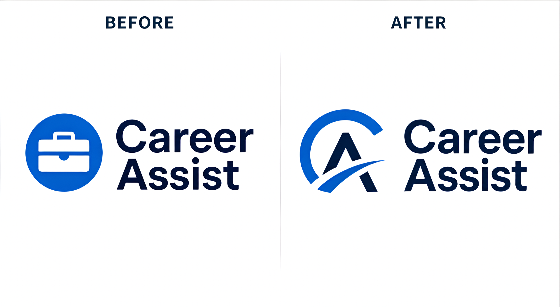
Sierra had built her own logo to get the business off the ground, but it no longer reflected where she wanted Career Assist to go. She needed a brand identity that matched her vision for the business.
What I delivered
A complete logo redesign, built on understanding her brand and her vision first rather than jumping straight into design.
Once we were clear on what Career Assist stands for, the new identity came together quickly — delivered fast, without sacrificing quality.
The result
A logo Sierra is proud to put in front of her clients — and a founder happy to say so in her own words.
The Concept
“Path to Progress”
A forward-moving monogram combining C and A, representing guidance, direction and career progression.
Chris completely redesigned a logo that I had done on my own.
I was really excited to have someone spend quality time unpacking my brand and my vision for the business — he was very quick to deliver something exceptional and far beyond my expectations.
I highly recommend Chris if you're looking for someone who really understands your brand and vision, whether that's redesigning a logo or creating one from scratch.
Sierra Crewther
Founder | Career Assist
Team Jake
A new name, a new identity — built around community.
The clientTeam Jake
The client
Team Jake — an organisation supporting wildlife and animal rescue in the local community, and providing inclusion and a good life for Jake within that community.
The challenge
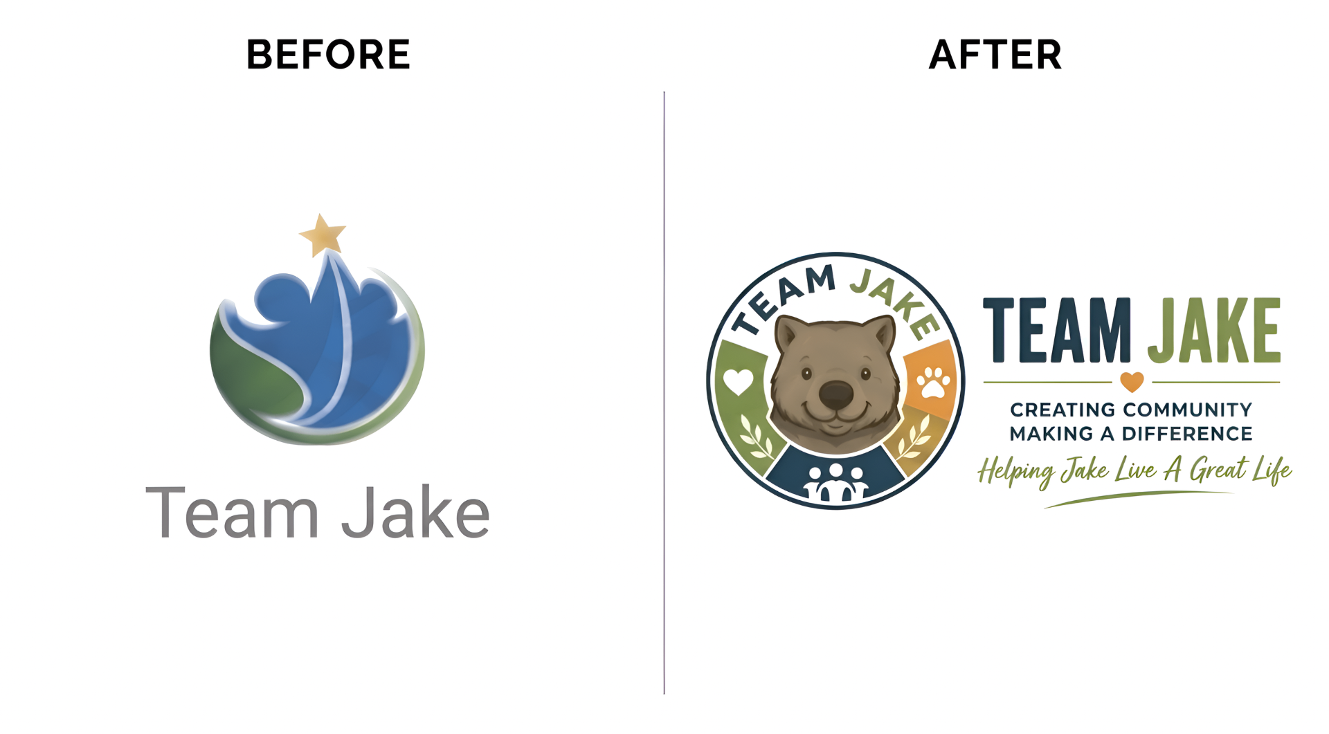
Team Jake had recently transitioned from a Pty Ltd to a Ltd company and rebranded under a new name this financial year. They needed a fresh visual identity reflecting both their wildlife and animal rescue work and their commitment to community inclusion for Jake.
What I delivered
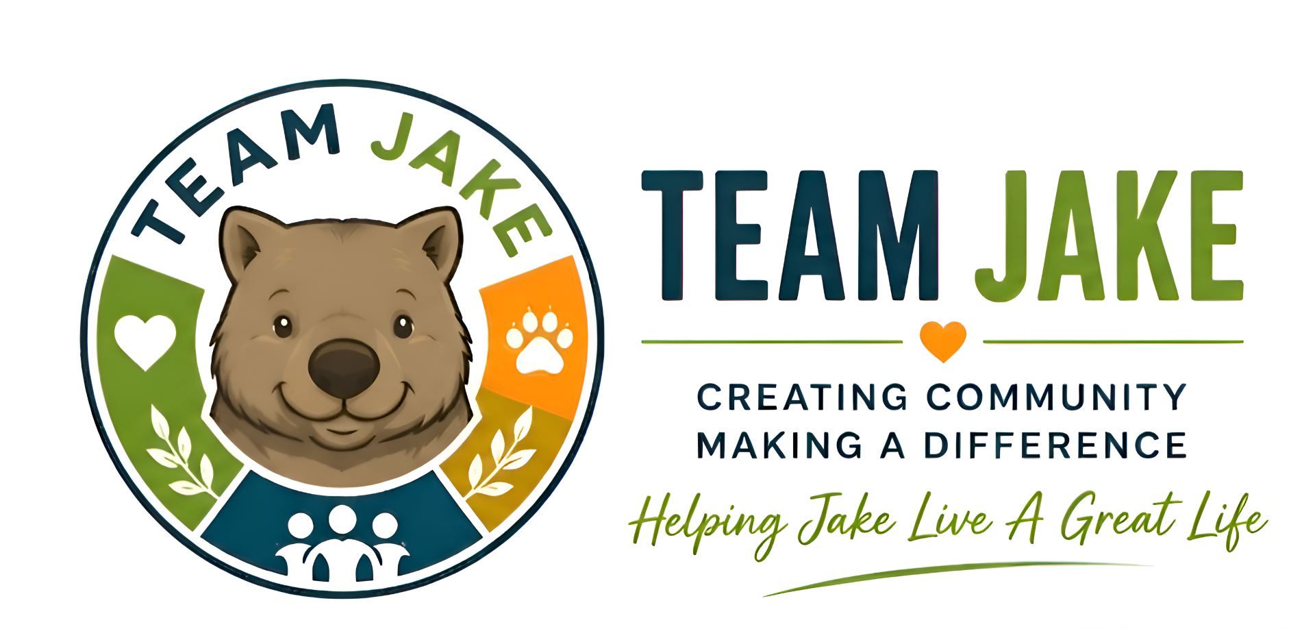
A new badge-style emblem logo — the “Wombat Shield” — featuring a wombat face at the centre, framed by a circular border containing a heart, paw print and community figures.
The result
A logo that represents both Team Jake's animal rescue work and Jake's place in an inclusive community, proudly rolled out across their website and stationery.
The Concept
“Wombat Shield”
A modern badge/emblem featuring a wombat face at its centre, framed by a circle containing a heart, paw print and community figures — representing community, care, animal welfare and trust.
We wanted something fresh that represented our desire to help wildlife and rescues in the local community, plus inclusion for Jake.
The design process hit exactly what I wanted to achieve — a logo that represented us supporting wildlife and animal rescues, and also the community supporting Jake with inclusion and acceptance.
I was very excited when I met you, and got the feeling that you understood exactly what I was after, particularly the community part and how important that is in Jake's life.
On reviewing the samples, I accepted one that was just fabulous, and it's now being updated across our website and all our stationery.
Janice Castledine
Team Jake
This year, Chris formalised his digital marketing skills through DMA Academy, training under Australian industry leaders William Wang and Stephen Esketsis.